Pastel Color Palettes That Always Look Cute Together
Five foolproof kawaii color palettes for stickers, spreads, and digital journals.
Why palettes matter more than skill
A solid palette can make a wobbly doodle look intentional. The wrong palette can make beautiful art feel chaotic. Pick first, draw later.
This is the most underrated piece of advice in journaling — not "practice more" or "buy better supplies," but simply: choose your colors before you start, and stick to them for the whole spread. It's the single change that makes the biggest visible difference, and it costs nothing.
Color theory sounds intimidating but the version you need for journaling is genuinely simple. You don't need to know color wheels or complementary hues — you just need two rules and five proven palettes.
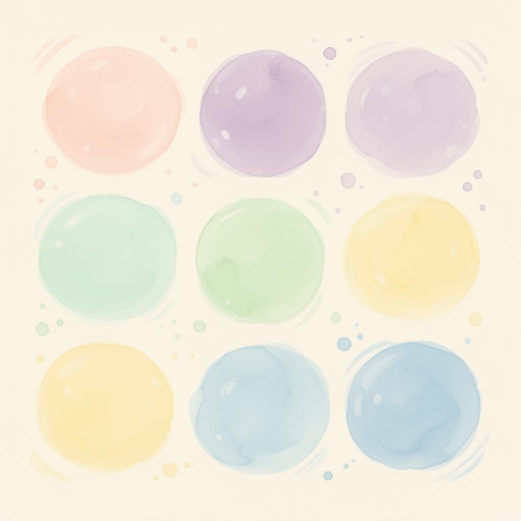
The 60-30-10 rule, kawaii edition
Use one soft base color for 60% of the page, a complementary pastel for 30%, and a punchy accent for the final 10%.
Practically speaking: if you're working with a blush-and-lavender spread, the blush fills most of the background washes and large text, the lavender shows up in headers and borders, and maybe a tiny pop of mint or gold appears on bullet points or sticker outlines only.
This ratio is forgiving. You can bend it (70-20-10, or even 80-10-10) and it still works, as long as you avoid the temptation to use every color you own in equal amounts.
Five palettes that always win
Each palette below pairs naturally with black ink and soft pencil shading — both of which you're probably using for handwriting anyway.
Blush & Lavender
Cotton-candy pink with dreamy lilac. Perfect for self-care and gratitude spreads. This palette is the quintessential kawaii combination because both colors sit in the same softness range — neither dominates or clashes.
The Cloud Cats pack is designed entirely within this palette: soft pinks, lilac backgrounds, white highlights. Using it in a blush-and-lavender spread means the stickers feel like they grew from the page rather than being placed on top of it.
Mint & Peach
Fresh mint with warm peach. Great for spring planners and study notes. This palette has a lively, slightly cheerful energy that works well for goal-tracking and productivity spreads without feeling corporate.
The contrast between cool mint and warm peach creates a naturally balanced page — neither color is dominant in temperature, so the eye moves easily across the spread.
Cream & Sage
Buttery cream with herbal sage. The "cozy bookshop" vibe. If you want a spread that looks like it belongs in a hygge coffee table book, this is your palette. It pairs beautifully with natural textures — kraft paper, washi tape, pressed flowers.
The Tiny Garden pack works perfectly here: the green tones in the plant illustrations sit naturally within a cream-and-sage palette, and the small pots and succulents add the right amount of organic detail.
Sky & Sherbet
Pale blue with sherbet orange. Reads as cheerful without being loud. This palette is slightly more unusual for kawaii journaling, which makes it distinctive. If you want a spread that stands out in a sea of pink-and-purple aesthetics, sky blue and soft coral is a fresh choice.
The Ghosty Nights pack has cool blue and purple tones that play unexpectedly well in a sky-sherbet spread — the ghost characters pop against the pale blue, and the crystal and moon stickers add a celestial dimension.
Mauve & Butter
Dusty mauve with soft butter yellow. Quietly elegant, very journal-core. This is the most sophisticated of the five palettes and the one that photographs best. The muted mauve reads as purple without being loud, and the warm yellow prevents it from feeling cold or somber.
Mixing your own
When inventing a new palette, start with one color you love and pull three neighbors from the same brightness range. Avoid mixing super-saturated with super-pastel — a neon element in a soft palette always jumps out as wrong.
The brightness range rule: if you squint at your spread and all the colors blur together into a consistent fog of softness, you're in the right zone. If one color still stands out sharply against squinted eyes, it's too saturated.
Matching sticker packs to palettes
The best approach for palette-matched spreads: download your sticker pack first, open it in any photo viewer, and use the color picker tool to sample 3–4 dominant colors. Build your pen and marker palette directly from those colors. Your stickers and handwriting will look like they were designed together — because in a way, they were.
Quick sanity check
Squint at your spread. If one color jumps out aggressively, it's too saturated. Swap it for a paler cousin.
And remember: if a spread looks "off" but you can't identify why, the culprit is almost always one color that's slightly too bright or too dark relative to the others. Try swapping it out before you redraw anything — 90% of the time that's all it takes.
You might also enjoy
- Kawaii Journaling 101 — set up your first spread using these exact palettes
- Printing Stickers at Home Without the Headache — bring your favorite palette to life in print